
Extracted UI patterns
Analyzed existing screens to identify repeated elements and patterns across the app.
Converted to components
Transformed repeated elements into reusable, documented components.
Defined tokens
Established design tokens to ensure consistency across all components and screens.
The typography system establishes a clear visual hierarchy throughout the app. Each text style serves a specific purpose, from headings for hero sections to compact labels for metadata. The consistent use of font weights and sizes creates rhythm and improves readability across all screens.
Heading 1
H1 • Display • 32px / 40px • Bold
Used for hero titles or onboarding screens where a visual hierarchy is required.
Heading 2
H2 • Page Title • 24px / 28px • Bold
Default section title for all screens. Used for primary page headings after onboarding.
Heading 3
H3 • Section Title • 20px / 24px • Bold
Subsection titles within a screen. Used below the main screen heading.
Body Medium
Body • 16px / 20px • Regular
Used for interactive text elements. Applied where text acts as a control rather than content.
Body Medium Bold
Body • 16px / 20px • Bold
Button label text. Used for all button states and primary actions.
Body Small
Body • 14px / 22px • Regular
Default body text for UI labels, form fields, and card content.
Body X Small
Body • 12px / 16px • Regular
Helper or informational text (e.g., validation messages, required field instructions) + bottom nav labels
Body X Small Link
Body • 12px / 16px • Regular
Secondary inline links (e.g. Forgot password?). Not used for main actions.
The color palette is built around two primary brand colors—blue for primary actions and orange for accents. Each color includes a full tonal range with 9 shades (50-800) to support different UI states, backgrounds, and accessibility requirements. Neutral grays provide flexibility, while semantic colors communicate system feedback clearly.
50
#E8F0F6
100
#D2E2EE
200
#A5C5DC
50
#FDF0E6
100
#FBE1CE
200
#F7C39D
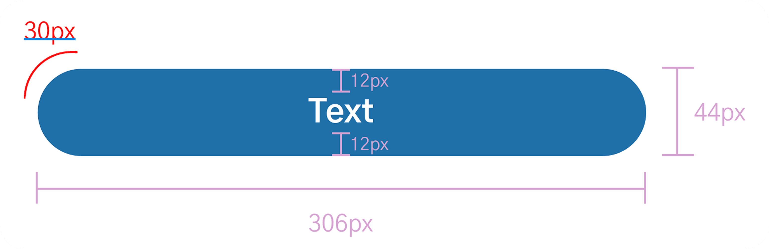
They ensure consistent padding, margins, and alignment across all components. These fixed values help keep the UI balanced, readable, and predictable on every screen.
64px
Token
space.64
Value
64px
Use
Header —> title
32px
Token
space.32
Value
32px
Use
Title → content
24px
Token
space.24
Value
24px
Between grouped elements
12px
Token
space.12
Value
12px
Use
Internal padding
Icons are selected for clarity and universal recognition. Each icon maintains consistent stroke weight and corner radius, creating visual harmony across the interface. Icons serve as tools in navigation and provide quick visual cues for actions and information throughout the app.
Primary action buttons used across the app. All variants share the same size, radius, and typography, and only differ in color and stroke.
All button labels use Body-medium-bold. Width stretches with its container; content stays centered.
The same component is used; variant is controlled by the Variant property with values: Default, Outline, secondary filled, disabled.

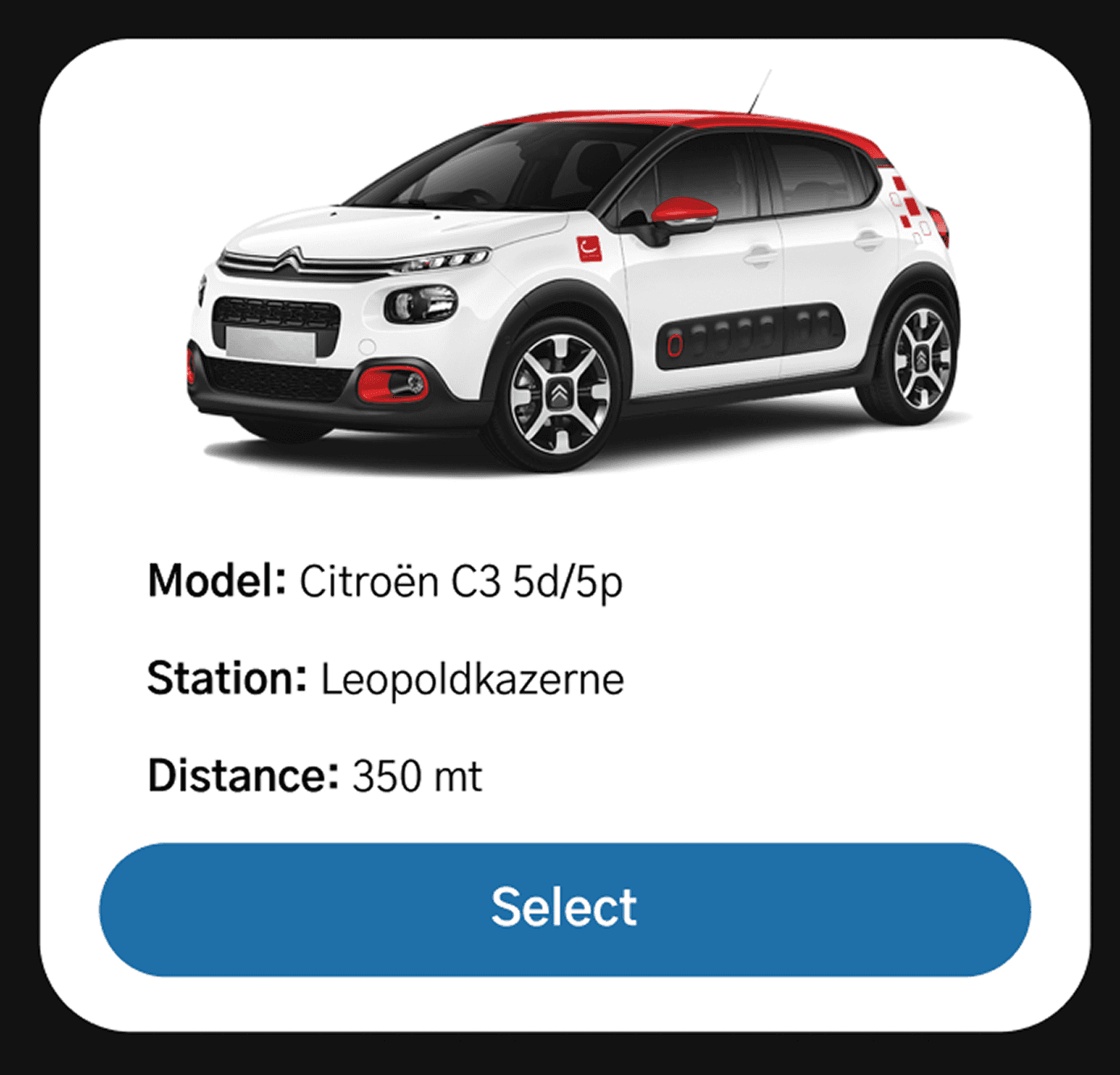
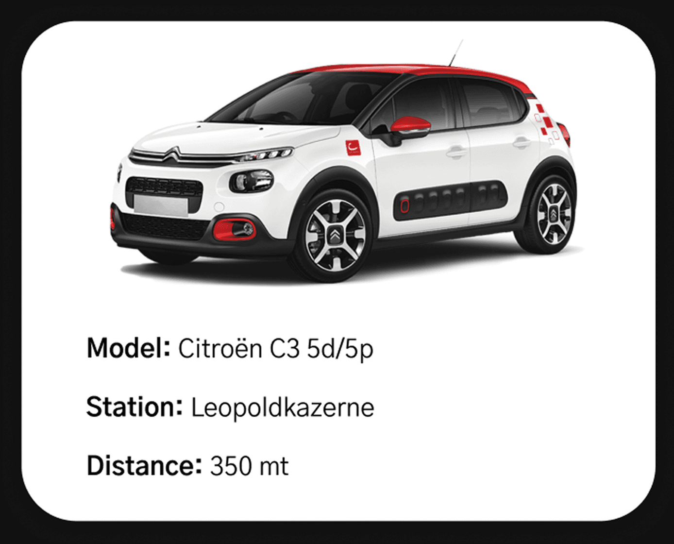
Car cards present vehicle information in a scannable, easy-to-read format. Used in the "Available cars" list, these cards help users quickly compare options and make informed decisions. Each card displays an image, essential vehicle details (model, station location, and distance), and a clear action button.
Every component includes comprehensive accessibility annotations and technical specifications to ensure seamless implementation. This structured approach bridges the gap between design intent and development execution.
Technical Specs
Each interactive element is documented with HTML attributes, input modes, autocomplete values, and state definitions.
Accessible Names
Clear accessible naming conventions ensure screen readers can properly announce all interactive elements and their purpose.
Action Definitions
Explicit action descriptions clarify user interactions and navigation flows for accurate implementation.
The complete Figma documentation includes detailed specs for spacing scales, color palettes with gradient systems, icon libraries, button states, form field variations, country selection components, car card configurations, and more. Each element is thoroughly documented with properties and usage guidelines.
Other design projects

Walk Paws Design
Social good app and responsive design


Walk Paws Implementation
From Figma to HTML, CSS and JavaScript
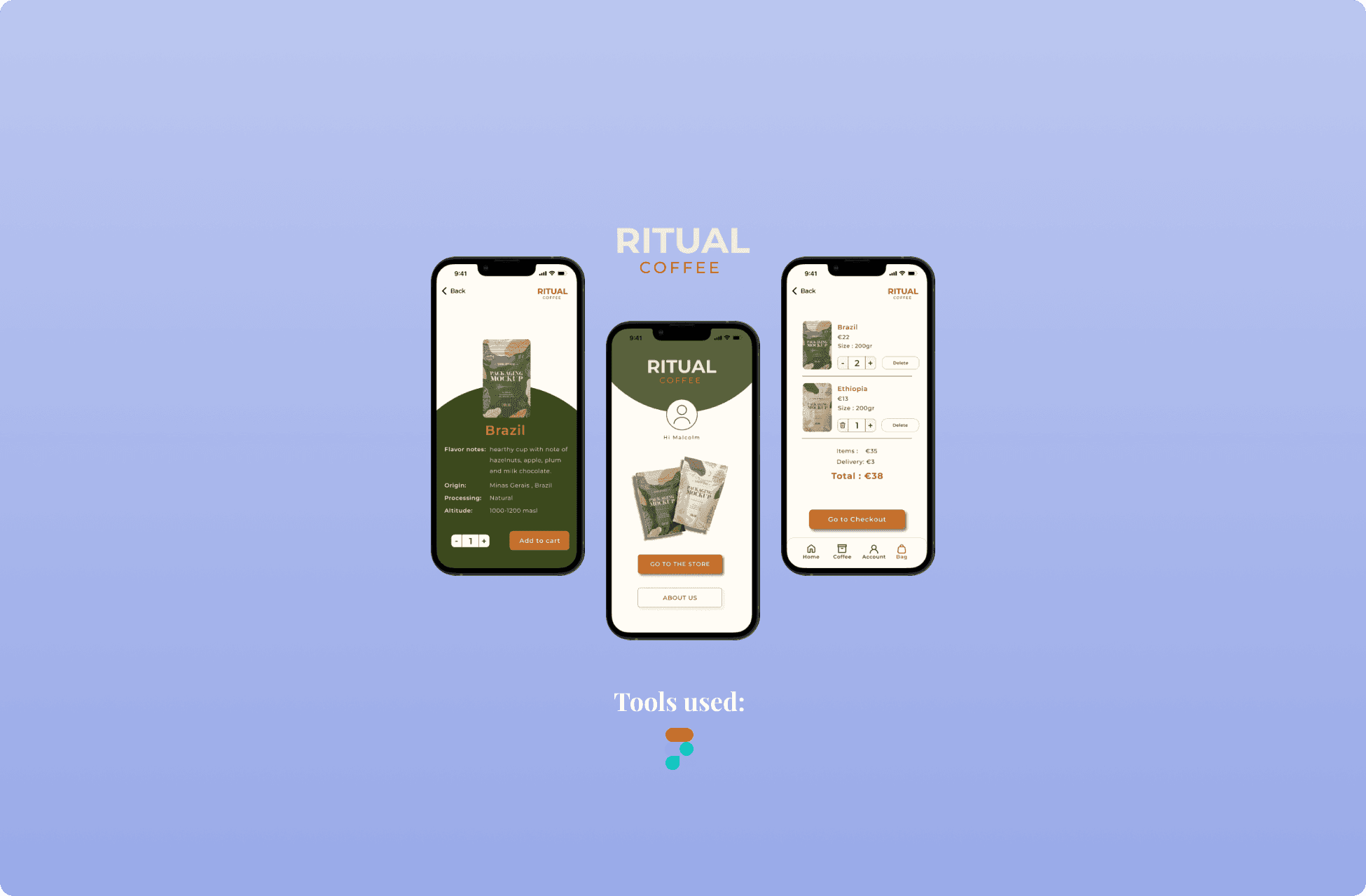
Ritual Coffee
eCommerce app with dark mode version

Grow Wise
Web app for a plant shop

Cambio Autodelen App Redesign
Redesign of the login flow for better accessibility